I know a lot of interesting people. Some I’ve worked with, some I’ve met while traveling the world, some just owe me money. My name may be on the website, but it seems kind of boring if I’m the only person whose voice is heard here. So I’m bringing some of my friends to the site, as time permits. I’m not a podcasty kind of guy, so I’m just keeping things simple: one guest, six questions.
 My next guest is Chesley Award winning illustrator, designer and art director LEE MOYER. You may have encountered his work in any one of the numerous RPG sourcebooks or card games he’s worked on, or in such diverse places as the National Zoo and the Smithsonian’s Natural History Museum. You’ve probably seen some of his posters or book covers; one of my personal favorites is the poster/cover he created for the silent movie of Call of Cthulhu. Lee and I have collaborated on a wide range of projects over the years; thanks to him, I’m on collectible trading cards in Mythos and On The Edge. Recently he just finished work on Check These Out 2013, a literary pin-up calender (his second) created in coordination with author Patrick Rothfuss’s Worldbuilders charity.
We’ve collaborated on many projects over the last twenty years. What’s your personal favorite?
 At Your Service – A sourcebook for the brilliant Over the Edge RPG.
This compendium of Mediterranean madness is not entirely our work of course (the redoubtable Doc Cross, Joughin & Spey, Neil Laughlin, and the Nephews joined in), but still holds a place of pride for me. As happy as I am with the wraparound cover design, illustrations, map, and logo I designed therein, our collaborations are what I most enjoy. Some highlights? It’s all highlights! The Midwich Family inside the Rose Hotel with their appropriate homage to John Wyndham and anagrams; the Lakshmis and the surprising appearance of an angry Lo Pan; the secrets of Marzipan and Morphine and its Painter of Light and Darkness ™; Gernsbach and Malloy who haven’t both been good guys since The Mask of Dimitrios, The Old Sods Club transporting the Junior Ganymede to Al Amarja: a voodoo-infused gang of nadsat malchicks too cool for skolliwoll; the mysterious shrieking prayer wheels of the Wind Farm; and the possible romance between a fallen angel and an accidentally incarnadine Golem: that adorable little girl from Venus; A macaroni factory that never made macaroni; and a restaurant that serves only fortune cookies.
Any similarities I might bear to Rose Hotel resident Dr. James Harris is a case of life imitating art, not the other way around.
What’s the story behind Check These Out? Why Literary Pin-Ups?
 My pin-up style poster for Moby Dick! The Musical proved the most popular piece I’d ever painted. I was surprised by the overwhelmingly positive reaction, especially among women, who were if anything more effusive than men. The more I thought about it, the more I wanted to bring old-school pin-ups back in the service of something well worth advertising: Literacy! I wanted to honor the old, but freak the system from within if I could. The strictures placed on the early greats (George Petty, Gil Elvgren, Joyce Ballantyne, et al) could be ignored. I hope that what I’ve done with books, tattoos, ethnicities, muscles, humanity and even underarm hair pushes the stale old envelope in interesting ways.
Representing authors living and dead is a great challenge and honor (Ray Bradbury was my hero growing up, and his inclusion here still feels miraculous to me).
And it’s all for the amazing charity Heifer International!
Which pin-up was the most challenging, and which was the easiest for you?
 Most Challenging: Neil Gaiman
Why? Having a model before having a concept is unusual. Knowing that Amanda Palmer was the model, who among Neil’s roster of splendid characters, would we cast her as? Yvaine? Coraline? Door? Delirium? Death warmed over? No. Amanda had been saying (and showing) for years that she WAS Media and who was I to disagree? And how does one show the fractal omnipresence of Media – with a very complicated and recursive image. And how would we arrange to get the reference shots we needed in a timely fashion? Happily I was invited to Readercon in Boston this year, and so was my friend, photographer extraordinaire Kyle Cassidy who’d already scheduled a shoot with his old chum Amanda in the window of time we’d need. But she didn’t have the time or costume for the second costume reference we needed. So I shot Venetia Charles in a Busytown costume that we borrowed from my friends and clients The Northwest Childrens Theatre. And to create the comic strip that fills most of the first week of June, I had to get more hints from Neil about what Shadow himself should look like. And then do the comic strip!
It was complicated. But as with most complicated projects, also deeply rewarding. Going in, I would never have even imagined doing an American Gods comic….  Easiest: Terry Pratchett
If I told you we’d shot Seth Green’s wife, that wouldn’t sound so good, would it?
But it’s true.
We went to LA and had the talented Allan Amato shoot reference photos of the Team Unicorn’s own Clare Grant. She was not only talented, but maybe the only model who comes with a large selection of wands to choose from (in addition to the big fluffy old bath robe I’d requested). The reference shoot was surreally short and the painting was very straightforward, in part because Terry Pratchett hadn’t asked for a specific character. So, as with Ray Bradbury and all the classic authors of the 2012 calendar, I had the leeway to paint an old-school pin-up in the Gil Elvgren tradition.
If you were trapped on a remote asteroid with only three pieces of your artwork for company, which would you choose? 
1. 2013 Check These Out – Literary Pin-Up Calendar (See the previous questions)
2. Starstruck – I spent more than a year painting over the sublime inkwork of Michael Wm. Kaluta
3. 13th Age – the RPG I’ve just completed with Rob Heinsoo and Jonathan Tweet and Aaron McConnell.
Oh, you just mean artwork?
Given a choice, I would much rather be trapped with three pieces of someone else’s artwork – like the Paul Komoda sculptures, Stephen Hickman painting and all those Mucha prints that grace my living space. But if it absolutely has to be my artwork, the clearest choice is Theora. This good luck charm was created by the quixotic urging of photographer Kyle Cassidy with the help of model and costumer Megan Skye Hale. Art Director (and Hugo-winning Author) Mary Robinette Kowal placed it on the cover of Weird Tales, which in turn won me the 2012 Chesley Award for best magazine cover. My Art Nouveau poster for Smashing Pumpkins and Hole bassist Melissa Auf de Mar would probably come next – not least because we signed it with Sandman artist Michael Zulli’s accidentally-purloined (and clearly magical) pencil. And then, there’s the tall thin mural call Past Go which features lots of great games (from Dark Omens to Cosmic Wimpout) in one comparatively small space. It was commissioned for Looney Labs World Headquarters, and the gala at its premiere is one I’ll always remember. 
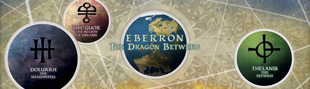
You’ve designed many of the most iconic symbols in Eberron, from the mask of the Undying Court to the symbol of the Silver Flame. You created the most important symbols of all: the thirteen dragonmarks. How did you come up with the look and feel of the Dragonmarks?
 Art Director Robert Rapier had some very clear notions about what he wanted, and the colors and tones outside the designs were all him. But the biggest influence of the designs themselves came from Katherine Hanna. She and I had lived together for many years in Virginia and I was deeply familiar with a style of drawing she used wherein the shapes were indicated with short curvilinear line segments. While the lines I used were generally longer, more contiguous, and arguably more Nouveau-inspired, it was her example that stayed with me.
Can I stray for a moment here and talk about how happy I was to finally be able to map Eberron properly in the 4th edition books?  What’s next?
A couple book covers for Pyr and Subterranean Press.
A painting for the wondrous Kennedy School. I don’t yet know exactly where it will be placed, but it cant be much more than 50 paces from where you (that is, Keith) got married!
Lots of travel. Two splendid Art Guest of Honor gigs: One at Norwescon (Seattle in March), the other at Keycon (Winnipeg in May); a seminar or two in Roanoke Virginia next summer; a trip to Brighton in a year’s time for World Fantasy Con; and the yearly choice twixt Readercon and the almighty San Diego Comic Con.
A Kickstarter more peculiar than any yet. It bears the tentative title of “There and Back Again” and promises excitement and adventure and really wild things! More details soon (I hope).
And lest I forget, a holiday card that I hope will answer all those difficult questions about Santa, temporality and causality.